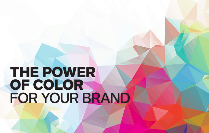
Recently we have attended a really thought-provoking webinar hosted by the Pantone Color Institute on the power of color and how it related to branding. The first part of their webinar took us through the psychology of color choice and the second part informed how to pick the right imagery for your future campaigns.
Here are some of our takeaways from the presentation by Laurie Pressman with Pantone Color Institute:
- Color is the key to brand strategy.
As marketers, we cannot underestimate the power of color and its effect it has on our psychology but also on our physiology. Each color has its own specific message and meaning. The trends and research on how color influences us is constantly changing, so we need to base our decision about color on the most current information available.
- A breakdown of each color family and its effect on the perception of people experiencing the color as it relates to marketing and branding. Research has shown that there is a real connection between the use of colors and customers’ perception of a brand’s personality.
Red: never ignored, viscerally alive, we are irresistibly drawn to it. It is also a sensual color, color of passion and romance.
Ruby red: used in luxury brands.

Marcela: more of an organic interpretation of red, rustic, 2015 color of the year.
Vibrant pink: perfect stand-in for red, more playful, high-energy, youthful.
Light pink: sweet and innocent, this color is very contextual, historically perceived as very feminine. Pink has evolved over time.

Neon pink: new approach to pink, this particular shade of pink stands for fighting abuse against women. Example, it is used in He for She movement started by the United Nations. Now pink is becoming gender neutral and is used for men and women interchangeable. It has become more accepted. It is used in all types of product categories. Some examples include, T-mobile in telecom industry and Baskin Robins in food industry.
Orange: flamboyant, fun-loving, dramatic. It is known as a happy color and used in marketing to kids 3 to 6 year age range. It gets attention instantly and used in safety and high-visibility clothing.
Deeper Oranges: more sophisticated, rustic.
Coral: welcoming color, pleasant experience.
Yellow: energy, heat, highest-visibility color, essence of light, cheerful, awakens the spirit. The brands use a lot of yellow and black together.
Brown: identifies with the land, earthy, represents longevity, reliability, durability, evokes the feel of back to the basics. Associated with coffee and chocolate. Some brand examples are UPS, leading logistics company, and L.L. Bean, active-clothing retailer.
Green: widest range of shades, most soothing, contributes to the production of good hormones, represents newness, youth and growth, freshness, nature. It is used a lot in beauty products.
Deep Green: trustworthy, traditional.
Light Green: in some cultures associated with heritage.
Blue family: the most universally accepted color family. It is #1 corporate color chosen by brands. It is perceived as trustworthy.
Navy: leadership, solidness, authority.
Cool blue shades: escape.
Electric blue: used more often in digital technology brands, high-energy, adopted by all kinds of companies, such as Chase. It is a signal color for recent generation. It replaced the red color as the attention grabbing color.
Purple: regal, non-conforming. Some visual examples are Prince and Purple Rain.
Purple pink: creativity, innovation. The brands such as Yahoo and T-mobile has adopted the color to stand out in the category and establish themselves as innovative leaders.
White: simplicity, silence, untainted, pristine, minimalistic. The soap brands use a lot of white in their branding. Apple is iconic for using white most recently.
Black: represents submission, provocative, sinister, expensive, luxurious.
Metalics: glamour, luxury, pure magic.
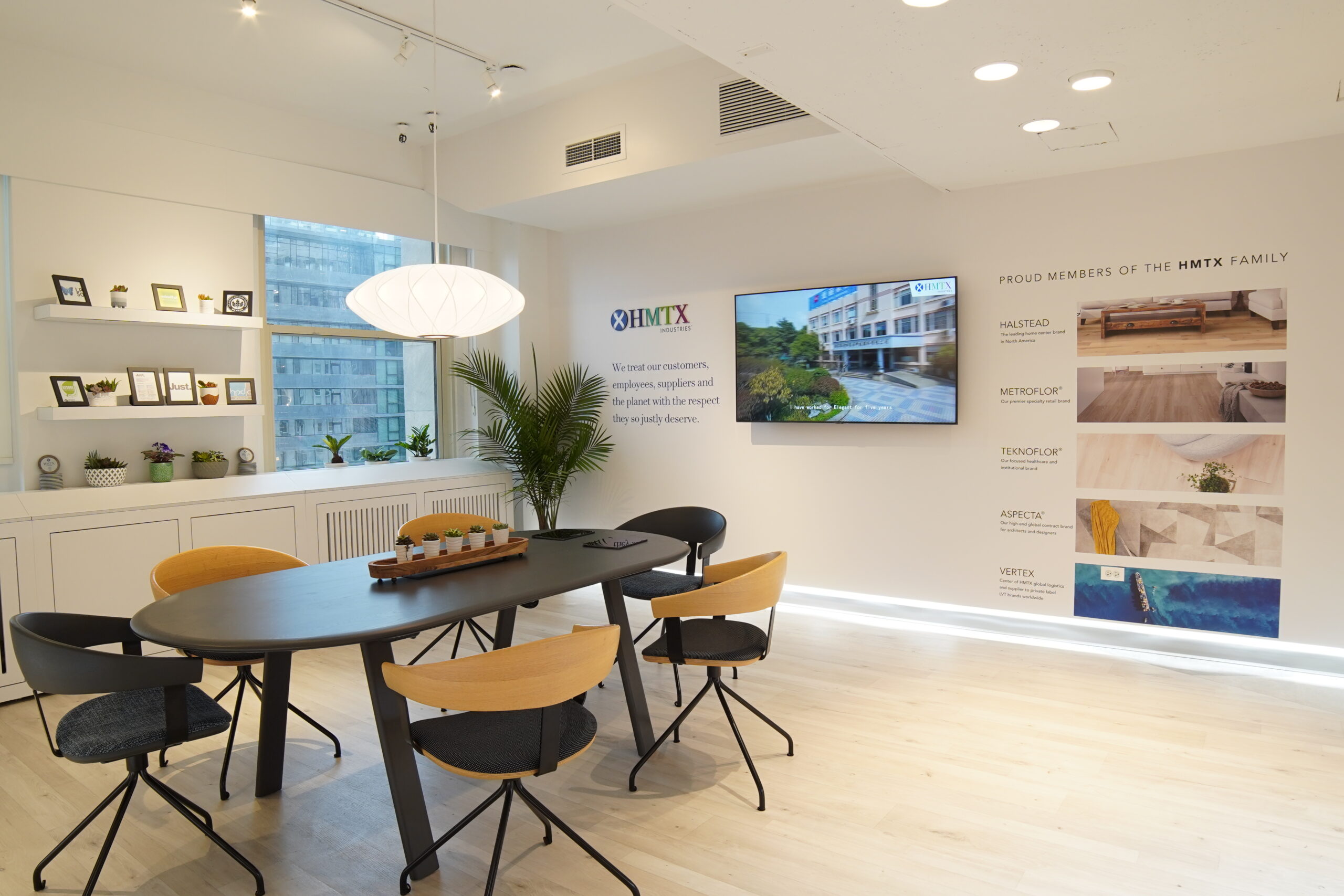
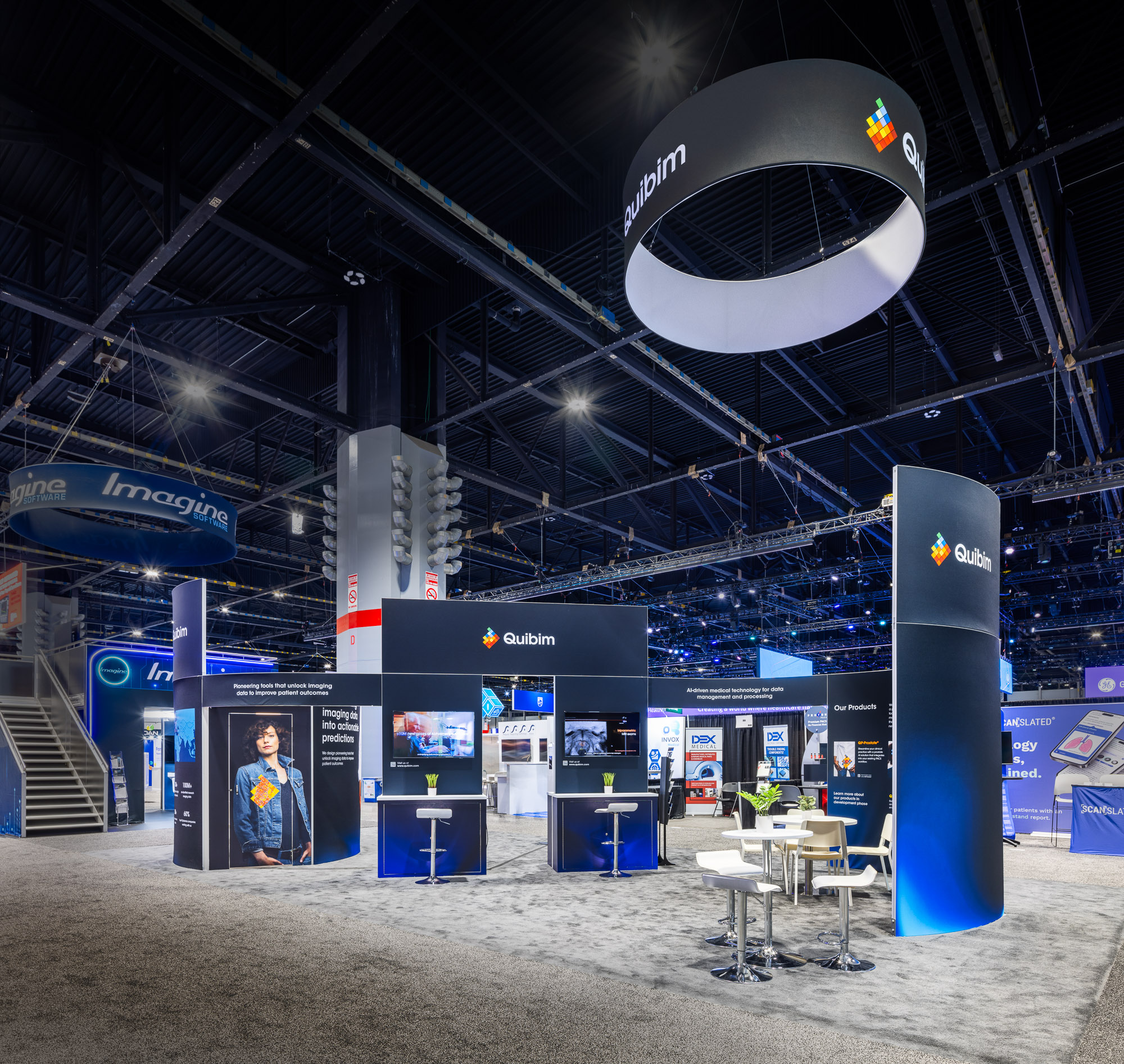
In closing, the presenter pointed out that brands rely on color to engage and stand out in a really competitive and saturated market place. That is nowhere more apparent than on the trade show floor!